I recently created a new blog, called LPPL Market Watch, for my research on LPPL Oscillations in the stock market.
Update June 2013: The Bubble Index

I recently created a new blog, called LPPL Market Watch, for my research on LPPL Oscillations in the stock market.
Update June 2013: The Bubble Index
On May 12, 2013
In Bach, Barry Ritholtz, blog, economics, escher, finance, Godel, investing, stocks, The Big Picture
The Big Picture is the name of Barry Ritholtz’s blog about stocks, investing, financial markets, and economics. Interestingly, I actually ran across this good blog will searching for Godel, Escher, Bach.
May 16, 2013 – Update:
 |
| Figure 1 |
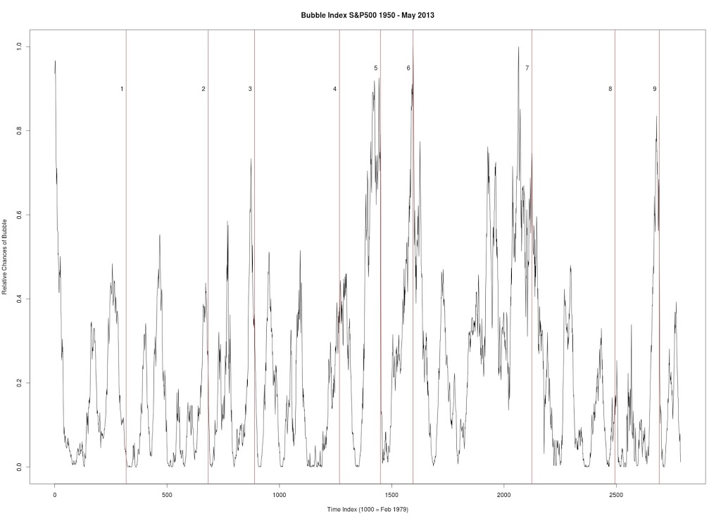
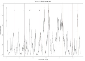
Figure 1 produced with C++ code. S&P 500. Seven year window of data. Every data point is a new week (vs. other graphs where every data point is a change of 4 weeks). Every peak in the market is corresponded by vertical line.
1. January 17, 1966 — followed by a 20.9% drop
 |
| Figure 2 |
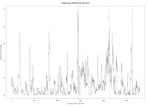
Figure 2 was produced with C++ code. S&P 500. Six year window of data.
3. April 19, 2010 — followed by a 16% drop
 |
| Figure 3 |
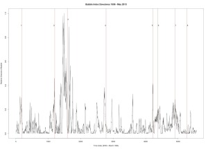
Figure 3 was produced with C++ code. Dow Jones Industrial Average. Six year window of data.
1. December 31, 1909 — followed by a 23% drop
2. October 2, 1929 — followed by a 43% drop
3. March 12, 1937 — followed by a 40% drop
4. January 8, 1960 — followed by a 15.6% drop
5. October 2, 1987 — followed by a 31.7% drop
6. July 27, 1990 — followed by a 17% drop
7. September 8, 2000 — followed by a 36% drop
8. October 12, 2007 — followed by a drop in excess of 42%
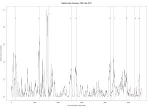 |
| Figure 4 |
Figure 4 was produced with C++ code. Dow Jones Industrial Average. Seven year window of data.
1. December 31, 1909 — followed by a 23% drop
2. October 2, 1929 — followed by a 43% drop
3. March 12, 1937 — followed by a 40% drop
4. September 23, 1955 — followed by a quick 8.7% drop and then recovery
5. January 8, 1960 — followed by a 15.6% drop
6. October 2, 1987 — followed by a 31.7% drop
7. July 27, 1990 — followed by a 17% drop
8. September 8, 2000 — followed by a 36% drop
9. October 12, 2007 — followed by a drop in excess of 42%
10. July 8, 2011 — followed by a 16% drop
Modelling market returns as independent random variables/martingales is the same as modelling the solar system as a geocentric system with the planets and Sun circling around Earth in epicycles. Predictions of the future are often vastly incorrect in both models. Quite surprisingly, this solar system model survived for thousands of years, despite it being totally incorrect. Then came Tycho Brahe who introduced a modified version of this Ptolemaic system. In Brahe’s model the planets orbit the Sun which orbits the Earth. While this model improved the accuracy of planetary motions, it failed to model reality. Perhaps it could be said that stochastic jump processes are equivalent to Brahe’s model of the solar system. While these jump process do a better job at modelling the returns than simple stochastic processes, they fail to grasp the underlying true model of returns.
 |
| Poor Market Forecasting |
And as we now know, the true model (for now) of the solar system was introduced by Aristarchus (Copernicus and Kepler helped bring forward this model) and predicts planetary motions with near perfection and represents the actual state of the solar system. I believe that the analogous model for stock returns has been introduced by Didier Sornette, Anders Johanson and others.
There is the interesting possibility of this: the stochastic volatility model referred to as the Ornstein-Uhlenbeck process represents the physical process of a “noisy relaxation process.” The Wiener Process represents Brownian motion or motion of a particle through a gas or liquid. So, if we consider the movement of a stock through a virtual container of many stocks (these stocks are the atoms in the Brownian motion) then we need to ask ourselves: What does the price, interest rate, returns, etc. mimic? It is NOT the equations! BUT the physical processes themselves. Why is an interest rate in a state of disequilibrium in the first place… that it must try to relax? Who put the stock in swarm of human hands all independently moving… It more correctly seems that the traders are following its movement at every second, waiting to grab it when the time if right (thus not independent)?
Page 4 of 7
The Meteorite (Chondrite) and its Organisms – Otto Hahn
October 12, 2019
Evolution from Space – Fred Hoyle and Chandra Wickramasinghe
May 28, 2019
From Virus to Cosmology – Fred Hoyle
January 9, 2019
Massive Crater and Younger Dryas
January 2, 2019
Microfossils and Biomolecules in Meteorites – Dr. Richard B. Hoover
November 12, 2018
Casual Randall Carlson
September 20, 2018
Daniel Sheehan
September 8, 2018
Dunbar’s Law and Economic Relationships
August 12, 2018
Scale – Geoffrey West
August 12, 2018
Mastering Bitcoin – Andreas M. Antonopoulos
August 12, 2018